Becton Dickinson
Becton Dickinson (BD) is the market leader in insulin delivery. The company is launching a new reimbursable module to assist people over 55 years old living with type 2 diabetes. This module will be integrated into the already launched BD Diabetes Care App, accessible via QR code.
The challenge was to create a fresh, fun, and independent brand for a product that would be closely linked to an established and traditional brand.
My tasks included selecting a name for the module, defining the brand identity and values, and designing a leaflet to be distributed at healthcare facilities. The module’s reimbursability according to the German ‘Diga’ law also needed to be clearly communicated.
Project type: Branding
Duration: September 2021
My role: UX Researcher & Visual Designer
Team: 1 Project Lead; 1 Marketing Specialist; 1 Mobile developer; 1 Motion Designer
Design process
We needed to understand the target audience and the market, so we started this project with extensive research. A phase of discovery.
We interviewed healthcare professionals, a specialist in diabetes, and German citizens. We also conducted a survey with people living with diabetes and carried out ethnographic research on social media groups.
The research showed that there are prejudices and misconceptions surrounding type 2 diabetes, which is often associated with bad habits. We also learned that people living with type 2 diabetes may be under much stress because of the condition.
Regarding the German market, the research showed that +55 citizens are active, smart, and appreciate word games and puns.
The research also demonstrated that Becton Dickinson (BD) was a familiar name among healthcare professionals, but few patients recognized the name.
With these discoveries, the team defined the problem: to create a fresh and caring brand that would create the habit of insulin injection using the app, at the same time a respectful and trustworthy brand that would incentivize the recommendation from healthcare professionals.


Concept development
Knowing that diabetes type 2 can be a burden for the patients, the main concern when developing the concept for the new module was to create a caring, respectful, and empathetic brand, and far from sounding judgmental patronizing. Friendly, inclusive, optimistic, respectful, and reliable were the core values selected for the new module.
Helvetica Neue is the main font used through out all communication in and about the Büddy module. Helvetica Neue is a clean and simple sans serif that is easy to read on both screen and print.
The colors for the module were inspired by the main app's palette, but saturated for higher contrast to increase readability and visual appeal. The blue and green tones can be associated with health care, but also give a soft and calm expression to the viewer, together with the happy yellow tone.


Name and logo
A special requirement from the client was a name for the new module. A name that would work well in Germany, the first target market, but that could also be used in other markets in the future. It also needed to be aligned with the brand values and the module's function.
Büddy was the chosen name for the new module. Besides resembling 'buddy' [a companion in the diabetic treatment], when written with the German Ü, the name is pronounced as 'BY:ddi', or BD, the acronym for Becton Dickinson.
The slogan 'Friendly Diabetes Care' was another way to link the new module and the original BD Diabetes Care App.
The logo for the Büddy module was partly inspired by BD’s already existing logo, with its bold, rounded letters that signify warmth and stability. The result is a friendly logo that feels fresh yet fitting for healthcare. It is cute and clever, just like Büddy.

Visual design
Büddy & helping hand
Aligned with the caring and gentle atmosphere we wanted to bring to the module, we created Büddy, a little creature that will guide the patient on their journey towards a healthier life.
This creature is spontaneous and full of life, but tends to be a bit clumsy and forgetful. Büddy has mood swings where its energy goes through the roof or drops rapidly, just like some type 2 diabetes patients.
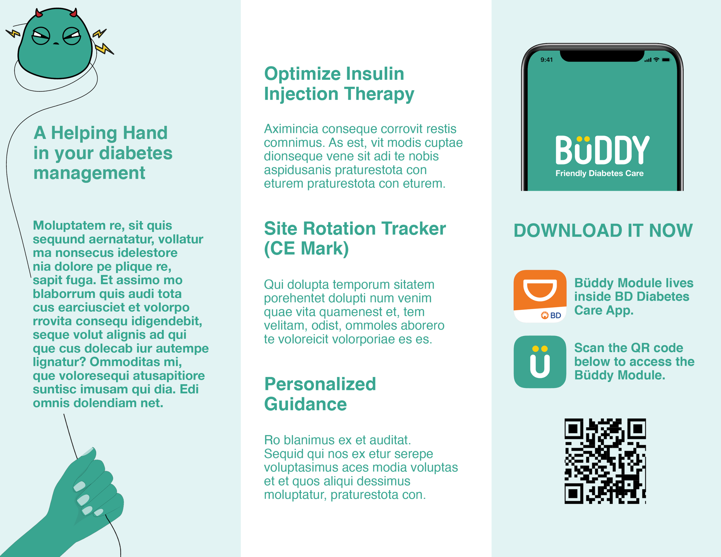
Büddy module represents a helping hand for a person living with type 2 diabetes. Present in marketing materials, including leaflets and social media, the Helping Hand interacts with Büddy and guides it towards a simpler way to understand and take care of its condition.


Leaflet
As the Büddy module is prescribed by healthcare professionals, it was essential to design print material to be distributed in healthcare facilities.
Besides presenting the module and providing information about the DIGA law, the Z-folded leaflet also contains a QR code with which the patients can download the module.

Feedback
-
"Well done! Seldom seen the BD team that engaged and inspired on the chat, and in their comments. All thanks to your work. I hope you feel proud."
Richard Laurits
Business Development Digital Health Manager at Becton Dickinson
-
"It was awesome to work with Patricia during the Branding module. A humble, fun, ambitious, straight forward and a creative person."
Sushil Jangra
Motion Designer
-
"Patricia is super clever, a great graphic designer, very organized and a good listener. She is sharp and soft at the same time. I would love to work with her again. Super woman!".
Salvör Thorlacius
Creative Director
Reflections
Communication is everything. The biggest challenge in this project was to develop something fresh, creative, and bold within the guidelines of an established brand. From the beginning, we kept clear communication with the client to understand their expectations, demands, and limits.
We cleverly overcame this challenge by incorporating elements of the original brand into Büddy: we used similar colors, implemented the original app's name into the slogan, and decided on a name that sounds like BD, the acronym for Becton Dickinson.
The client was so satisfied with the first pitch that they invited the team to present the new brand to a group of managers and stakeholders in the United States, Germany, and Switzerland through a video conference. The presentation was a success!
The Branding module was also the first project with a client at Hyper Island, so we did not know each other very well. It was interesting to experience the team development and see how the team dynamics improved as we felt more open and comfortable.
In this project, I was able to apply my communication skills when interviewing, taking notes, pitching the project, communicating with the client, doing research, and writing. I was also happy to be involved in the entire concept development and to strengthen my design skills, from research to execution.
