My Work
Here’s a selection of projects I’ve worked on — from fully automated self-storage platforms to sustainability tools, mobility services, and even early visual communication work. Some were big, complex systems built over the years. Others were fast-moving projects or illustrative pieces designed to inform and support. But in every case, I focused on clarity, empathy, and designing with care.
Branding


Storex Self-Storage
Building a storage platform from scratch
I led the design for Storex, a fully automated self-storage service developed in collaboration with EQT Exeter. Over two years, we designed and launched the desktop and mobile web platforms, as well as native apps for iOS and Android — all before the physical facilities even existed.
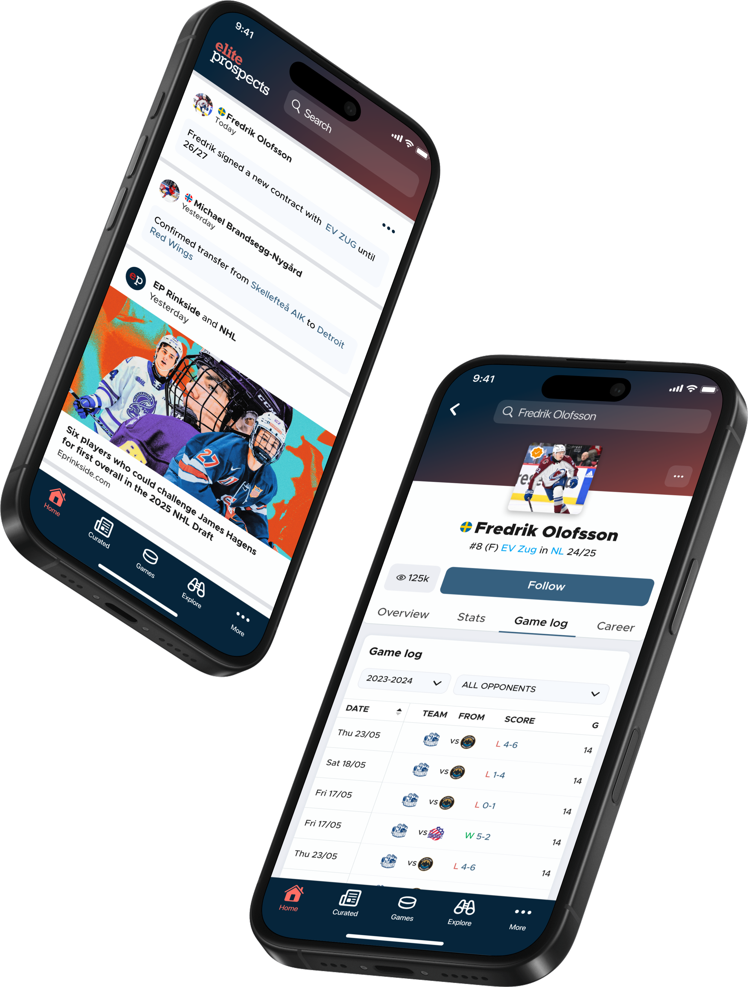
Elite Prospects
A concept app for the hockey community
Elite Prospects is one of the world’s most visited hockey databases. I led the design of a concept app focused on helping young players and their families find better opportunities through data, connections, and improved visibility. The project involved deep research, usability testing with 700+ participants, and stakeholder workshops to shape an MVP that speaks to both fans and scouts.
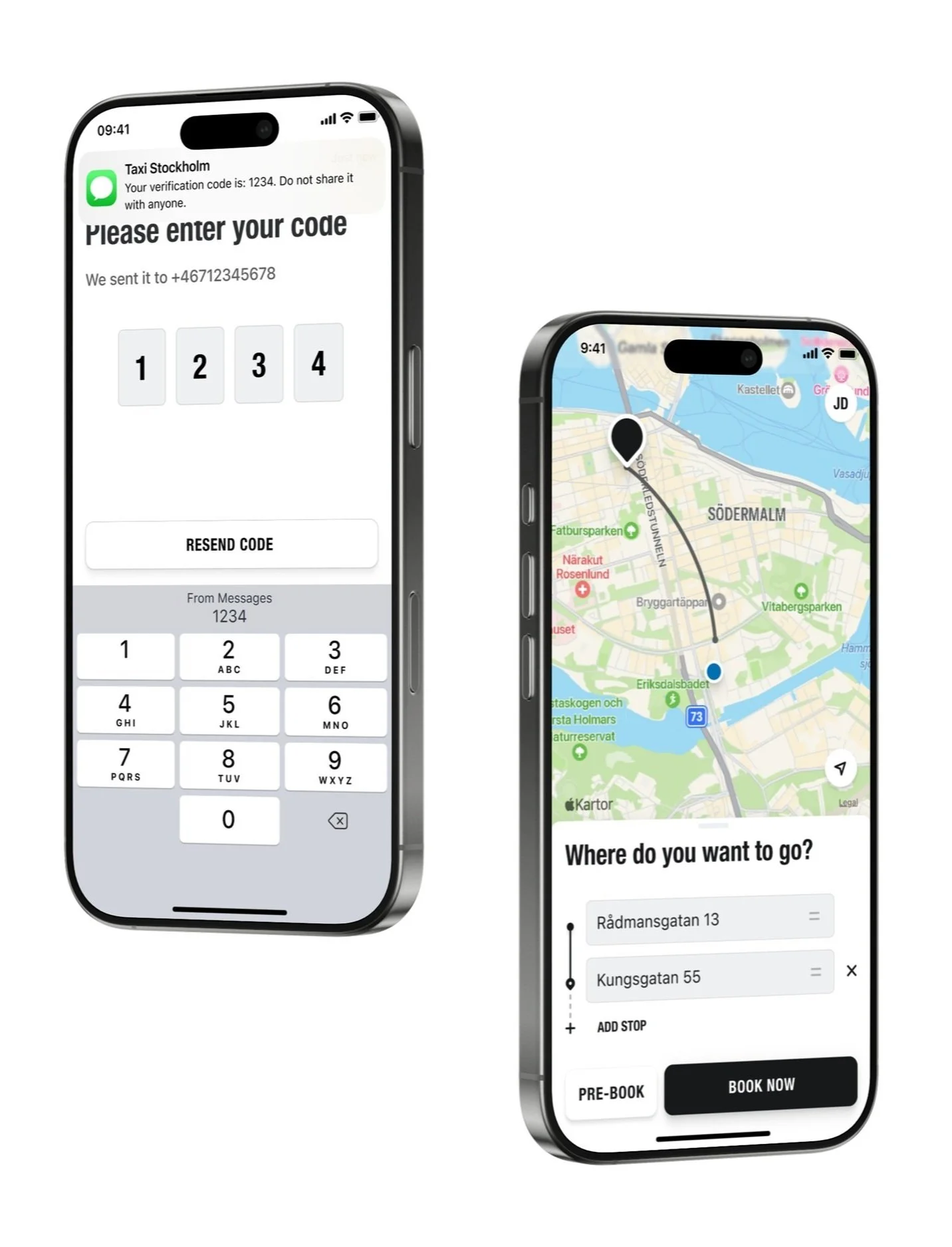
Taxi Stockholm
Improving every-day travel
During this long-term collaboration, I contributed to both the rider and driver experiences, designing flows like OTP login and "add a stop" — where security, system limitations, and usability had to align. A solid example of real-world UX balancing user needs and technical constraints.

Envac Reflow
Designing to reduce, reuse, and recycle
We designed an app that connects residents to Envac’s smart waste inlets, allowing them to track how much they throw away and learn how to recycle better. With usage data and educational tools in one place, the experience encourages more mindful, sustainable habits.

Becton Dickinson
Branding for diabetes care
Becton Dickinson (BD), a leader in insulin delivery, launched a new reimbursable educational module aimed at individuals over 55 years old living with type 2 diabetes. This module was added to the BD Diabetes Care App and can be accessed through a QR code. The challenge was to create a fresh, fun, and independent brand for a product that is closely linked to an established and traditional brand.

Matkakohteena Brasilia
Revamping a tourism guide under pressure
When the Brazilian Embassy in Helsinki was tasked with updating and redesigning an outdated travel guide, I took full ownership of the project — from content editing and copyright clearance to full layout and visual design. What began as a Word document became a fully redesigned book, completed on an impossible timeline, with zero budget and limited publishing experience.

Dica da Rosinha
Visual tips for Brazilians living abroad
While working at the Brazilian Embassy in Helsinki, I created Rosinha, a digital character who shared friendly tips with Brazilians in Finland. The illustrated series, posted on social media, helped explain topics like passports and voting in a clear and accessible way — an early step in my journey toward user-centered design.